
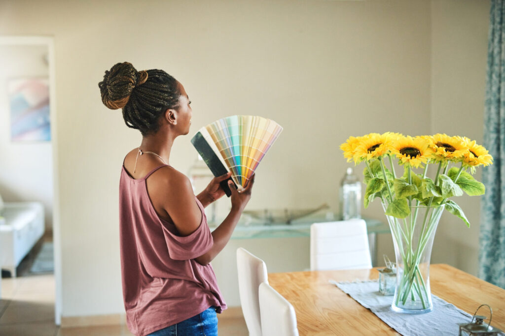
Has the decorating bug bitten you? It could be time to refresh your outdoor furniture with some bright green cushions and big pops of pink in placemats and napkins. Or perhaps you want to get away from the soothing dove grey bedroom walls you once loved and warm them up with a soft pink or a deeper mocha. Whatever trending colour for 2023 you pick, chances are you first saw them on a catwalk.
That’s because the experts putting together the biannual Pantone colour trend reports, released to coincide with London and New York Fashion Weeks, mull over, play with, test, and ponder fashion, makeup, design, and other trends before determining which colours should make it from their workshops to your backyard furniture.
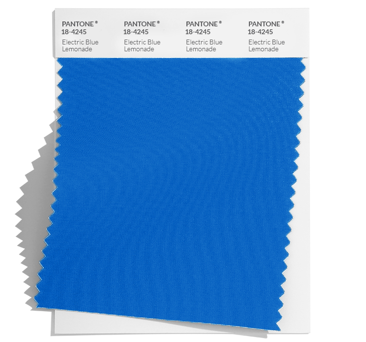
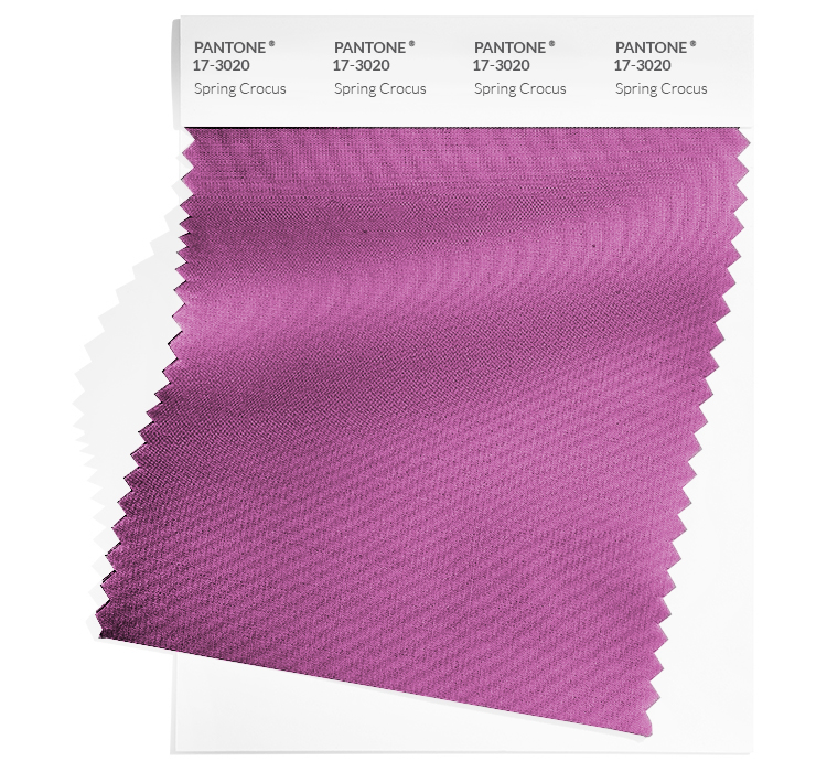
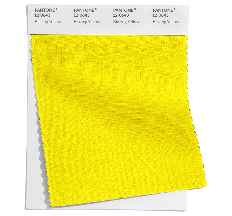
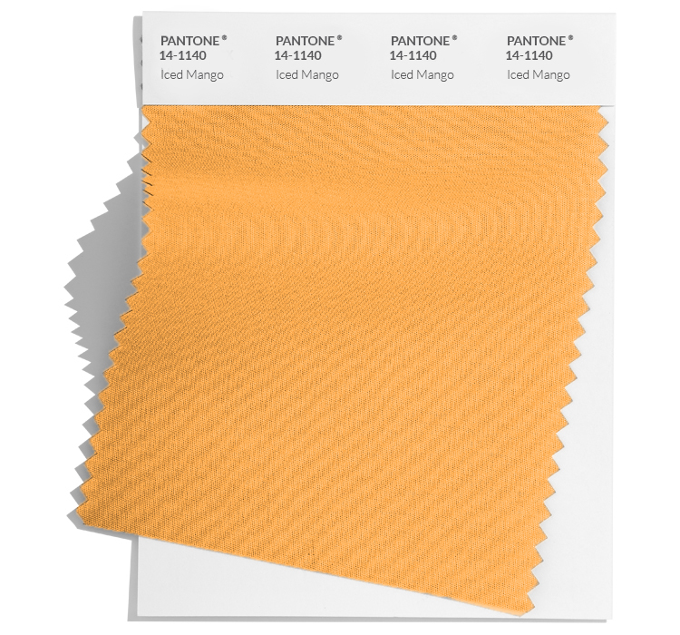
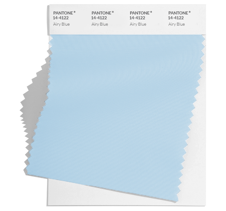
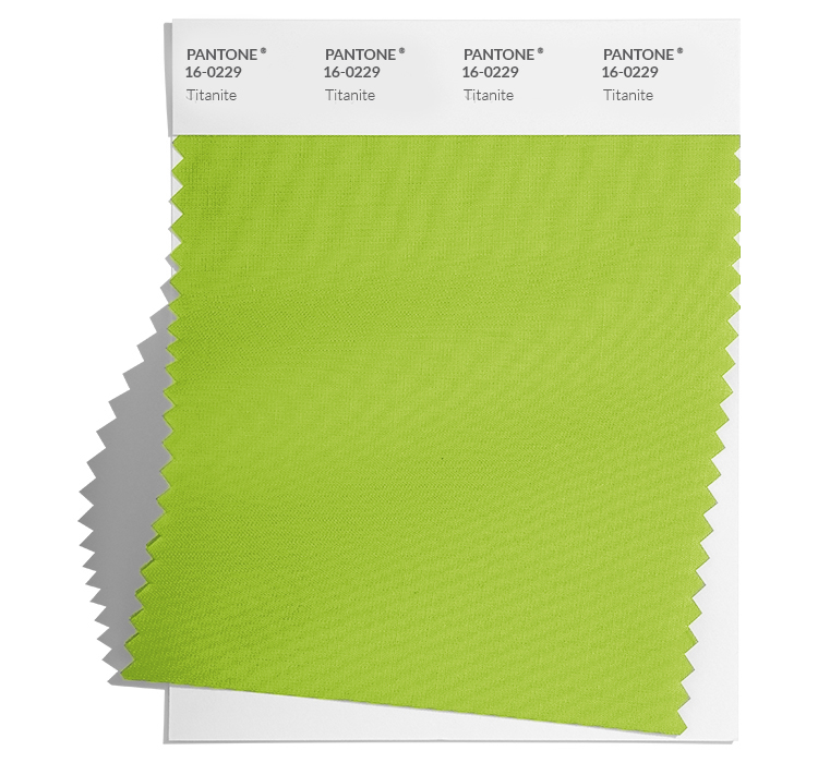
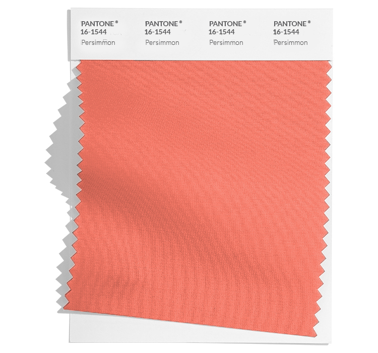
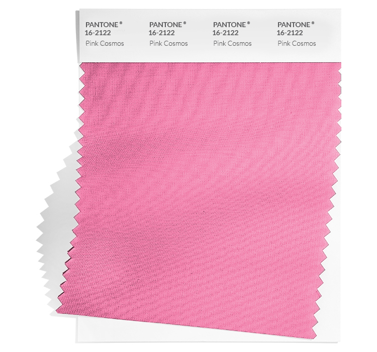
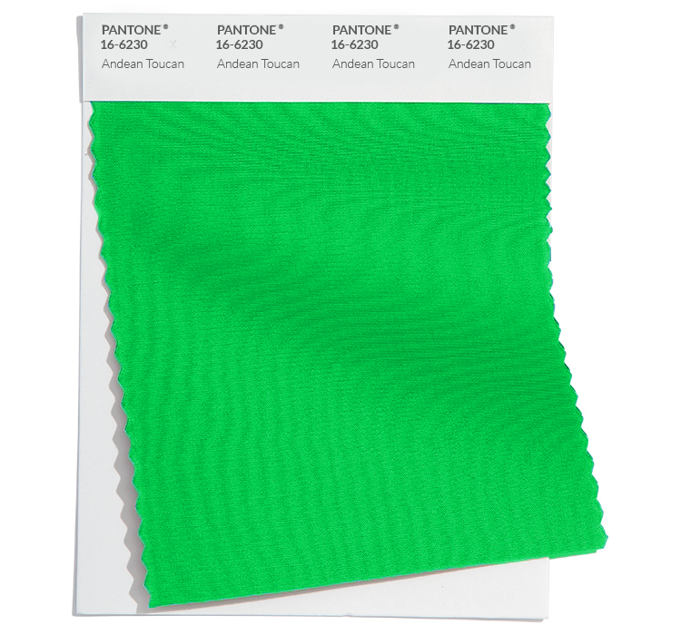
This year, the Spring/Summer 2023 palette is a combination of bright, fresh hues and playful soft tones, like those seen in the London Fashion Week runway shows featuring Yuhan Wang’s ultra-feminine use of green (Pantone Andean Toucan), Simone Rocha’s fabulous pink puffy blouses (Pantone’s Pink Cosmos) and rising UK star Molly Goddard’s floppy cardigans (Pantone Airy Blue, Pantone Mocha Mousse) amongst others. Other seasonal trend colours include Cherry Tomato, Persimmon, Iced Mango, Blazing yellow and Spring Crocus, amongst others.
From there, those colours make their way through the fashion food chain to home décor at Bouclair, paint swatches at Dulux and outdoor living pieces you might get at Rona or Home Hardware (where CAA Members earn 2% CAA Dollars with online purchases.)
“We have a team of ten across North America who work on looking at colour trends in automotive, fashion and popular culture,” Sharon Grech, Benjamin Moore’s colour and design spokesperson and member of the Color Marketing Group once noted. “Then we talk about what we are seeing in Texas versus, say, Montreal. We go to international trade shows like Maison and Objet in Paris or the interior design show in Toronto.”

So how do you use the trending colours for 2023 around the house? Try these tips.
Test before committing
Paint a small area of a room and look at it in a variety of light conditions, like a sunny day, at night and when it is overcast. The more time you think about if that blue shade is right, the greater your success rate. Dulux Colour Sample Pots are available in 100ml (about 3.38 oz) sizes to help you make the right choice. (CAA Members also get 25% off and earn 3% in CAA Dollars®!)
If in doubt, connect the pieces
If you are not sure about the right colour for a series of rooms, like living room to dining room, buy a few pieces of décor that colour. A carpet, cushions and wall décor will connect the rooms visually. If using bright tones, lean towards neutral shades for furniture. Check out Dufresne’s collection and get 2% in CAA Dollars.
Have a plan before you buy
Impulse buying when you are redecorating is amazingly easy to do in the store but harder to execute once you get home and realize your new décor does not fit the primary plan. Go for consistency in a room in both colours and wood tones. If shopping at Bouclair, where CAA Members get an extra 5% off, the stores offer a 30-day return policy.
Decide how often you want to paint
The more muted the colours, the longer they can stay in the background. You can adjust and update a room with décor over time to keep it current. Brighter walls are bold and beautiful, but you will tire of them more quickly.
Be bold in the backyard
Patio furniture is probably the easiest place to incorporate new colour trends. Table clothes, napkins, glasses and even garden art can all be jumping-off points for adding bright elements to your outdoor living space. Both Stokes and Think Kitchen (where CAA Members get an extra 5%) have great dinnerware, serving dishes and drink dispensers to discover.
Respect tradition
If you love this year’s bright, contemporary colours, like the greens, pinks, and blues, avoid mixing them with darker, more traditional shades. They do not exactly clash, but they do not work in harmony, either. The one exception is if you add a bowl of fresh flowers, which can pull colours together. CAA Members can save 20% and earn 5% in CAA Dollars when they order from Teleflora.
Want to find more deals for CAA Members? Visit caaneo.ca/rewards for the full list.